


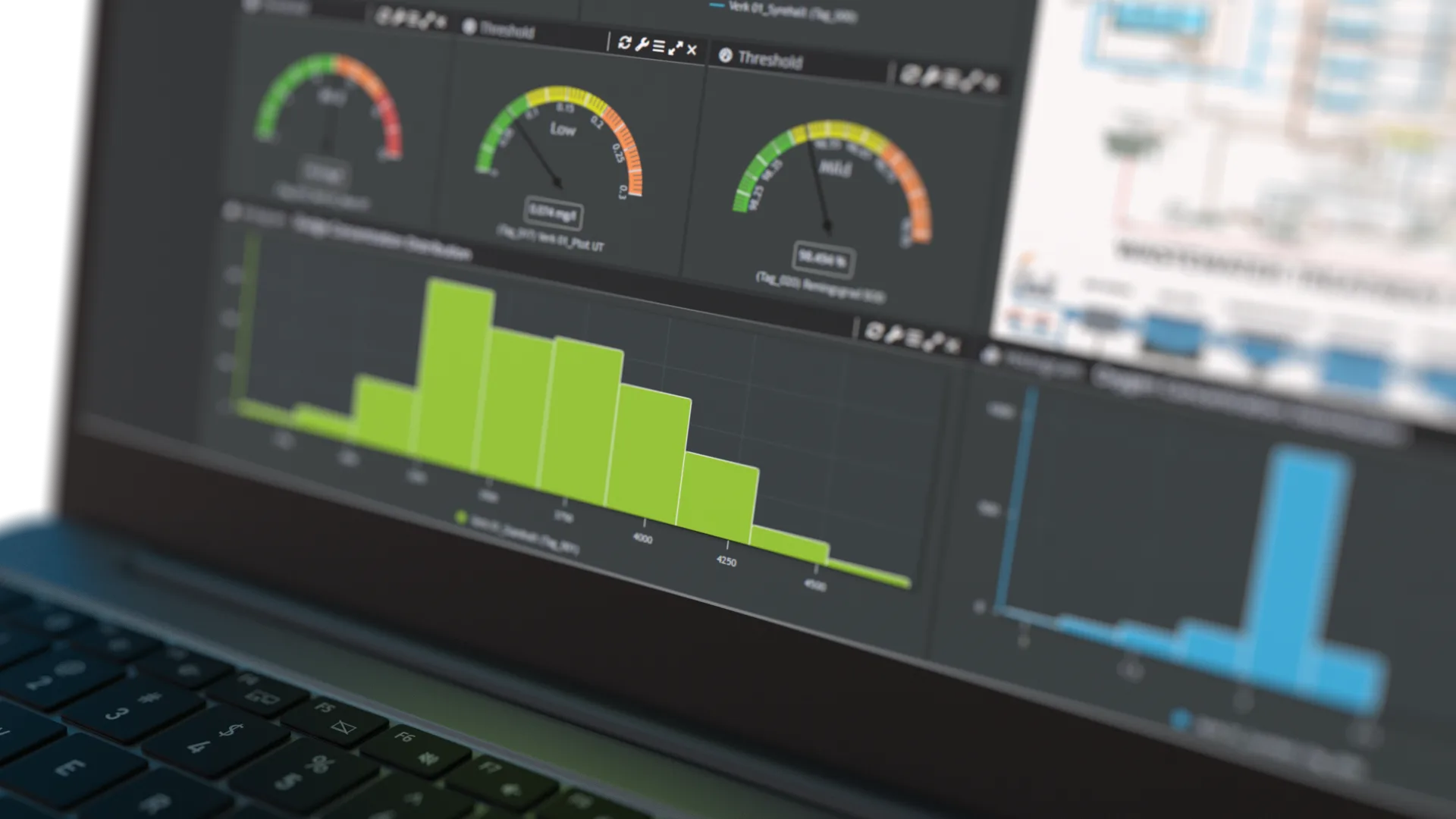
Deviation detection
Catch changes early and focus attention where it matters. With a shared view of the process, teams can spot drift, outliers and emerging issues before they turn into incidents.
Across industries
From raw signals to reliable decisions. Detect deviations early, automate reporting, and keep operations stable.
introducing
A secure web-based platform for connecting sensor data from multiple sources and making it available, understandable and useful in one clear environment.
Book a Demo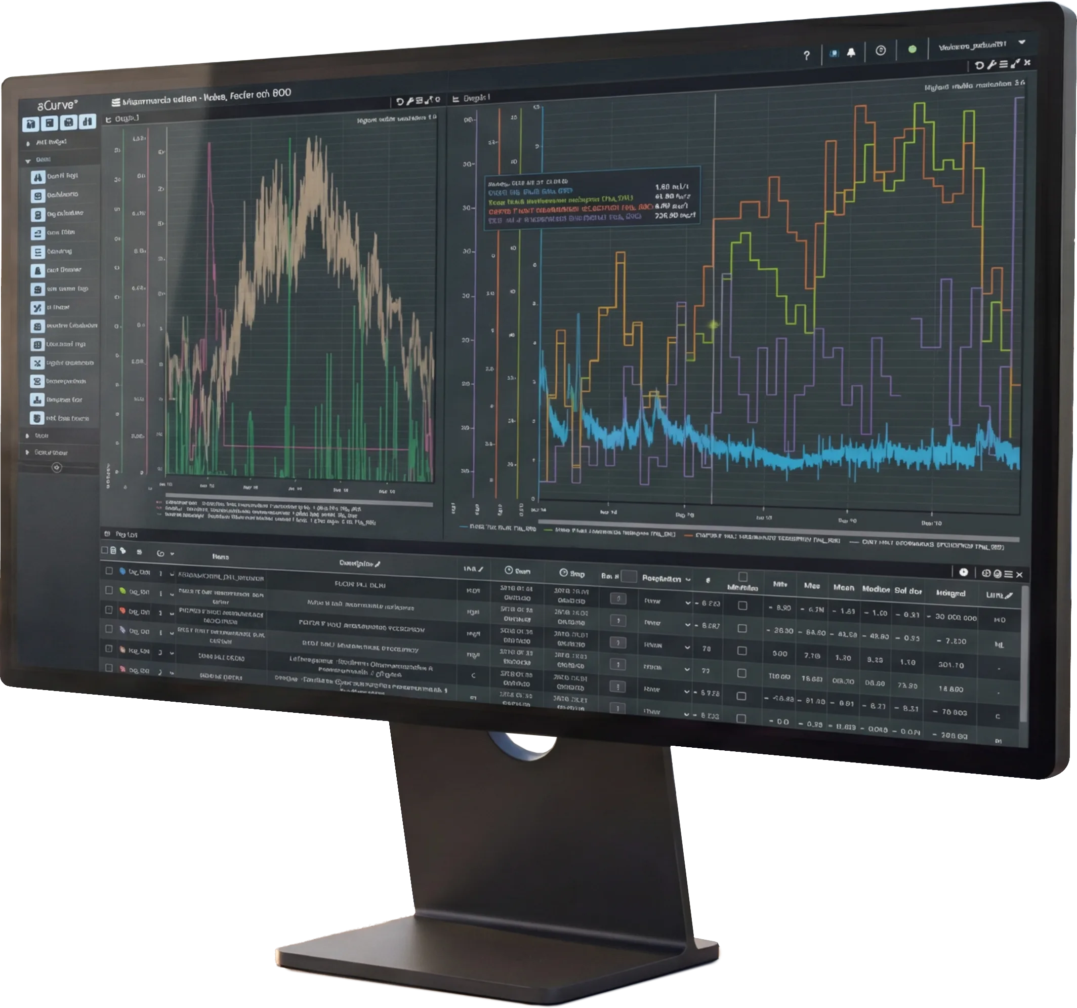

Across industries
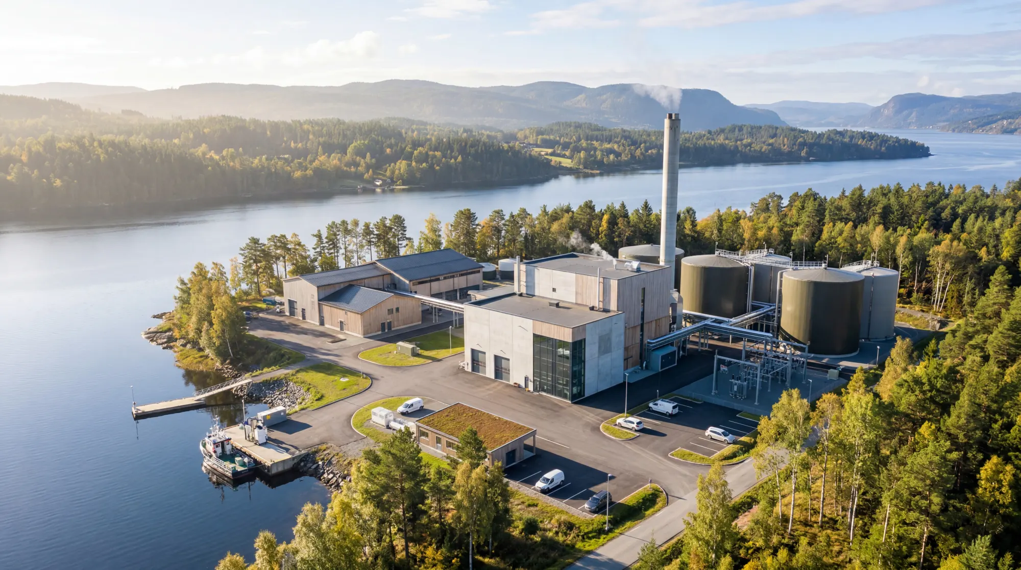
From water operations to industrial processes, life science labs and energy systems, teams face the same core need: data that can be trusted, understood and acted on. aCurve is built for environments where daily operations, follow-up and reporting depend on a clear view of what is happening, across roles and sites.

Core capabilities
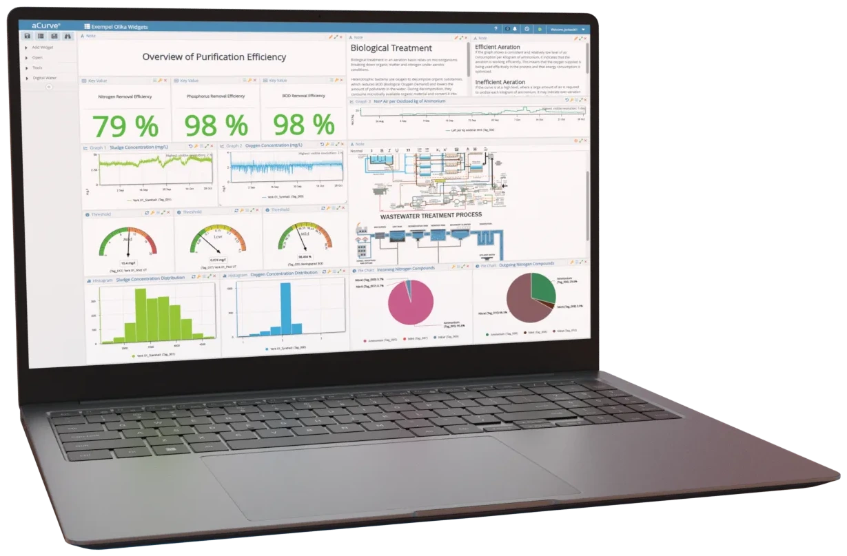
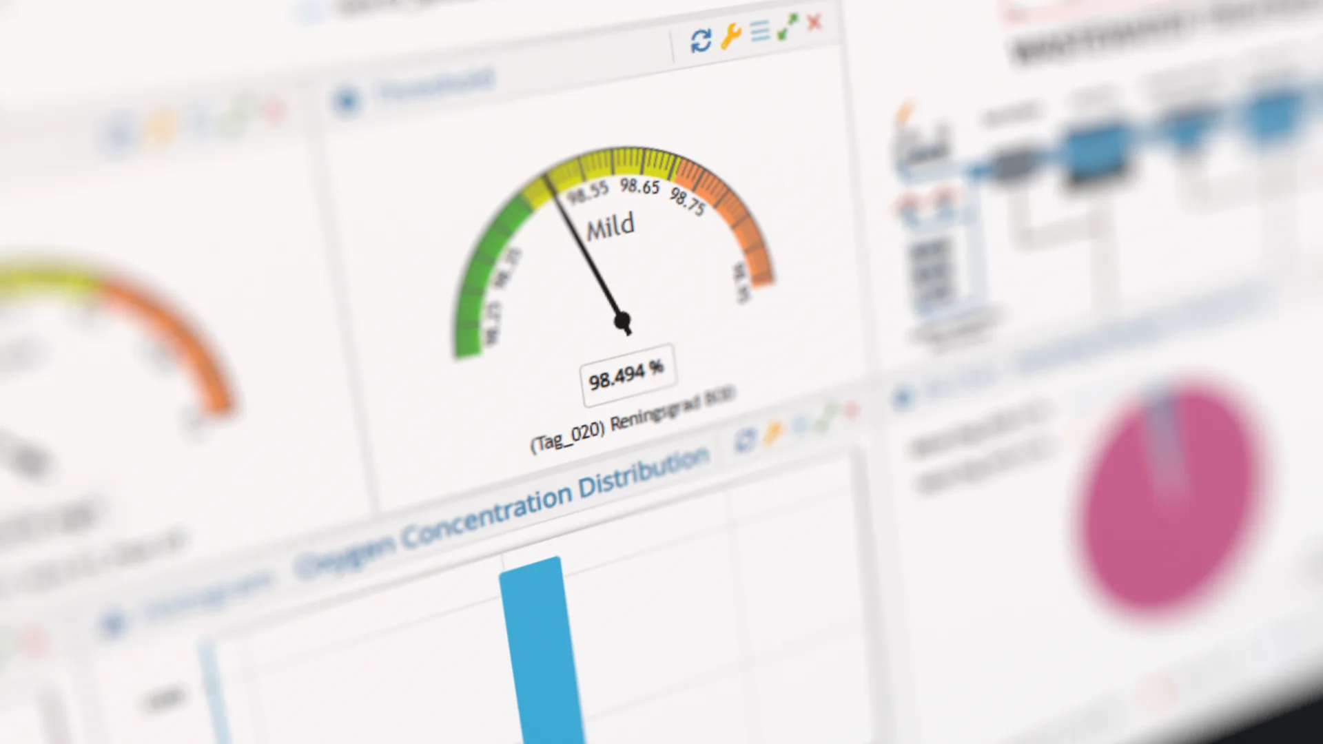
aCurve helps teams collect, understand and act on sensor data in a more structured and reliable way. It brings together relevant data sources in one secure and accessible platform, helps teams identify patterns early, and turns complex data into clear, recurring reports that support faster decisions
The challenge
Operational data is rarely in one place. Signals live across systems, formats and teams, definitions drift, and it becomes harder to trust what you see or act in time. That's when the data is there, but the overview is not.
See it in context
Hover or tap a point to explore how signals across the site come together.
Link key signals and data points across the operation and turn them into a shared operational overview. aCurve connects sources, makes operational data available across teams and helps teams interpret trends so deviations surface early and reporting becomes easier.

The challenge
In many operations, the data already exists. The real challenge is alignment: signals live in different systems, definitions drift over time, and teams lose trust in what the numbers mean. aCurve creates a stable foundation by bringing sources together, making data easier to use across teams, and making trends easy to interpret in one shared view.
That's how operations teams move from reactive firefighting to repeatable routines: deviations surface earlier, reporting becomes less manual, and performance drivers become clearer.
Start with one area, prove the overview, then expand as confidence and use cases grow.

The opportunity
Operational data lives in many places: systems, lab results, meters and maintenance logs. aCurve helps teams work from one clearer view, where data is structured, definitions stay consistent and trends are easier to compare over time. That makes it easier to follow changes, interpret performance and act with greater confidence across teams and routines.
The result is less manual wrangling, faster follow-up and a more reliable basis for daily operations and reporting.
in three steps
See what's happening. Understand why. Improve what matters.
Bring together data from SCADA, historians, lab systems and IoT sources.
Explore trends, correlations and anomalies with powerful self-service analytics.
Turn insights into better decisions, higher efficiency and improved process performance.
Use aCurve to strengthen daily operations, reporting and long-term performance. Start small, expand when the overview is proven.
Catch changes early and focus attention where it matters. With a shared view of the process, teams can spot drift, outliers and emerging issues before they turn into incidents.
Bring together data from multiple sources into dashboards and analytics the whole team can use. Build a shared operational understanding, spot deviations earlier and make faster decisions, with reporting as a natural by-product.
Reduce waste, lower energy and reduce chemical consumption by understanding performance drivers. Compare periods, identify key drivers, and prioritize improvements with confidence.